Entorno
Signage typeface and experimental variable font.
Entorno was my degree project in TypeMedia (2018) the master in type design at the Royal Academy of Art, The Hague, Netherlands.
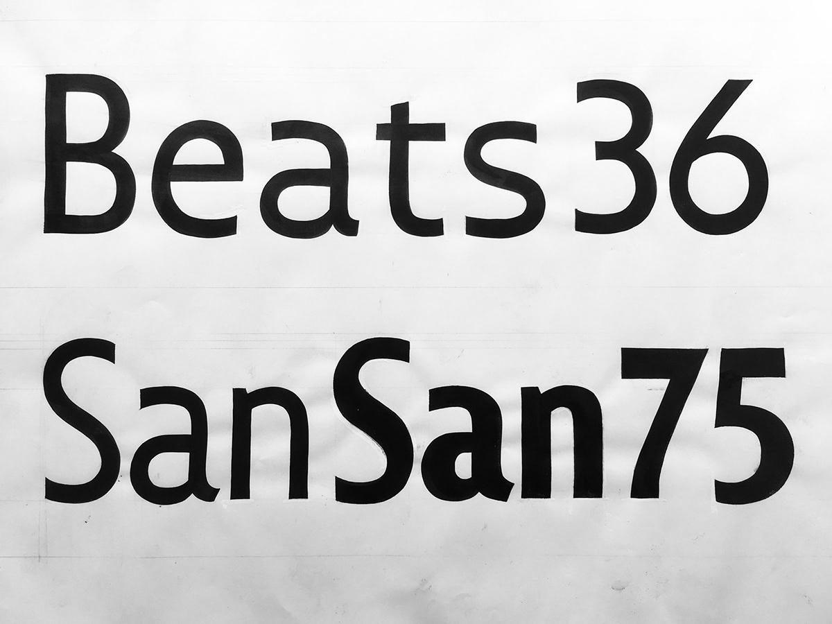
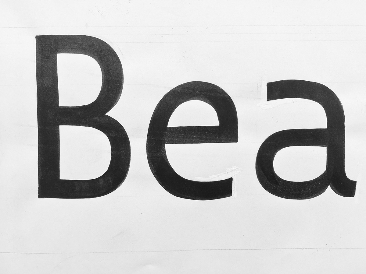
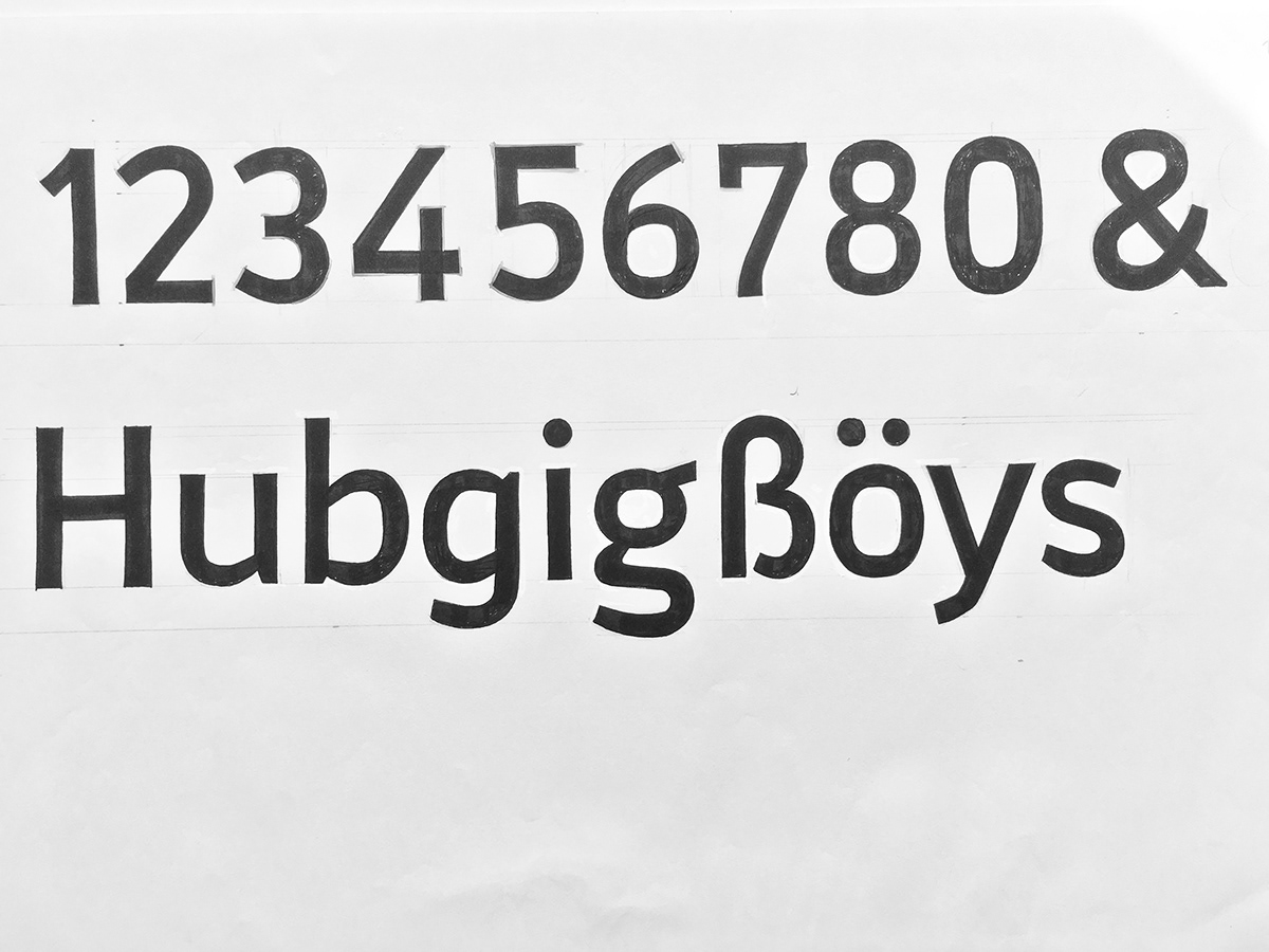
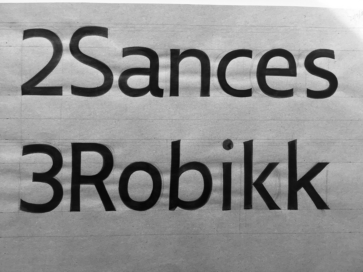
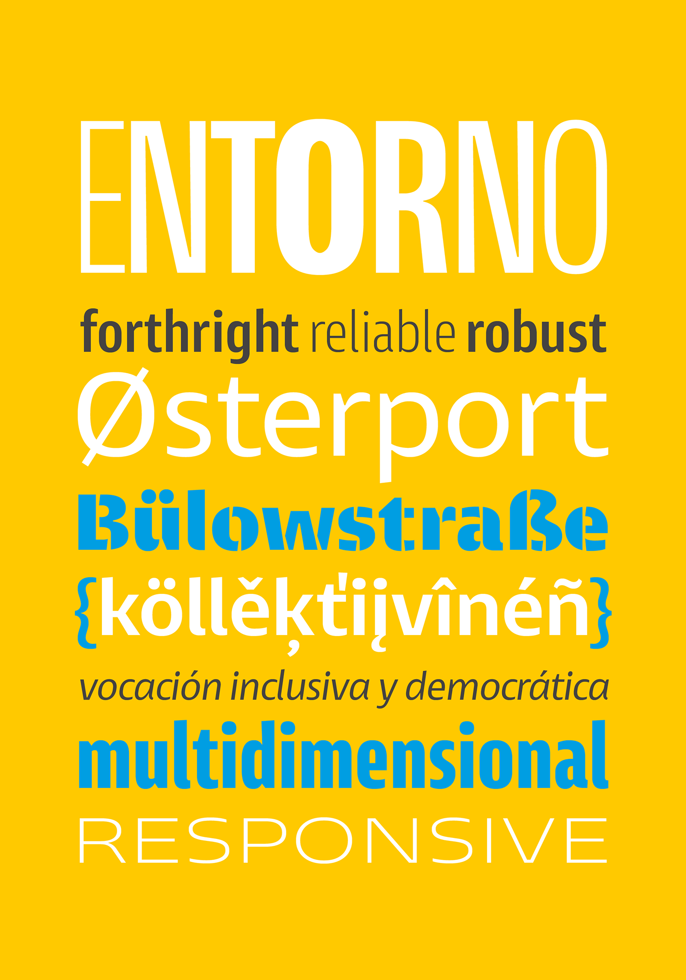
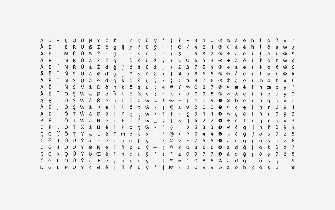
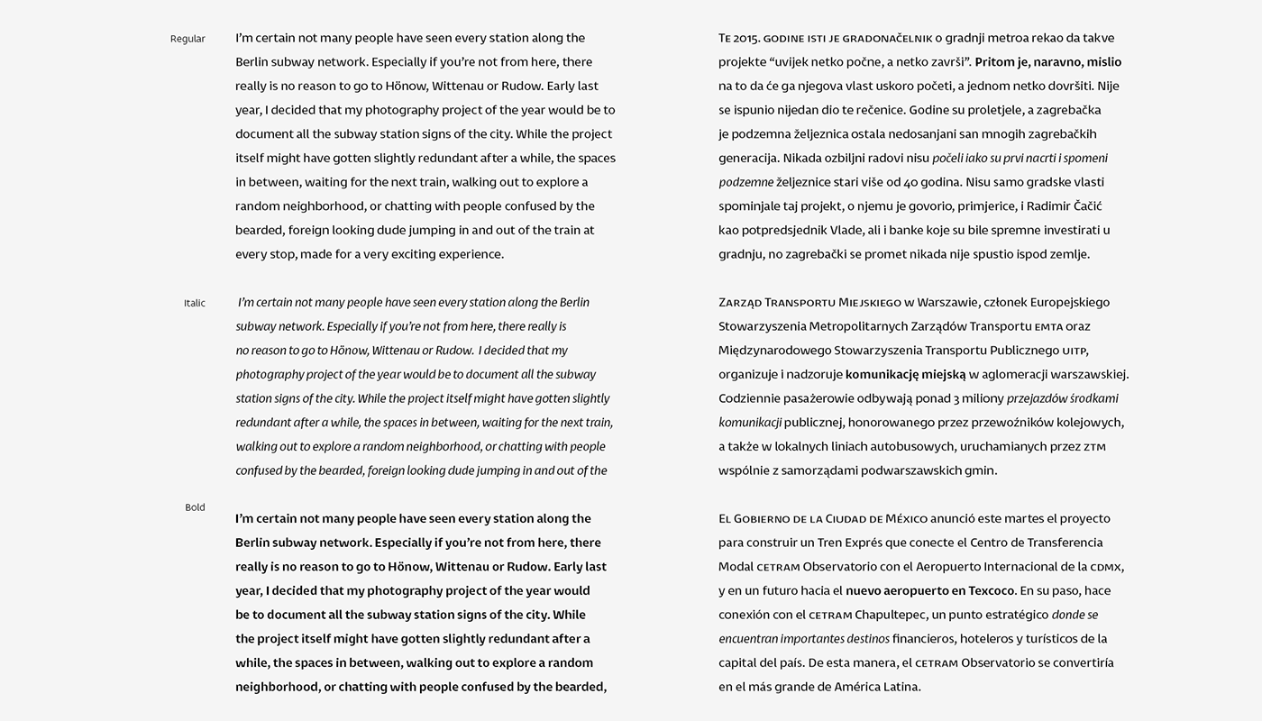
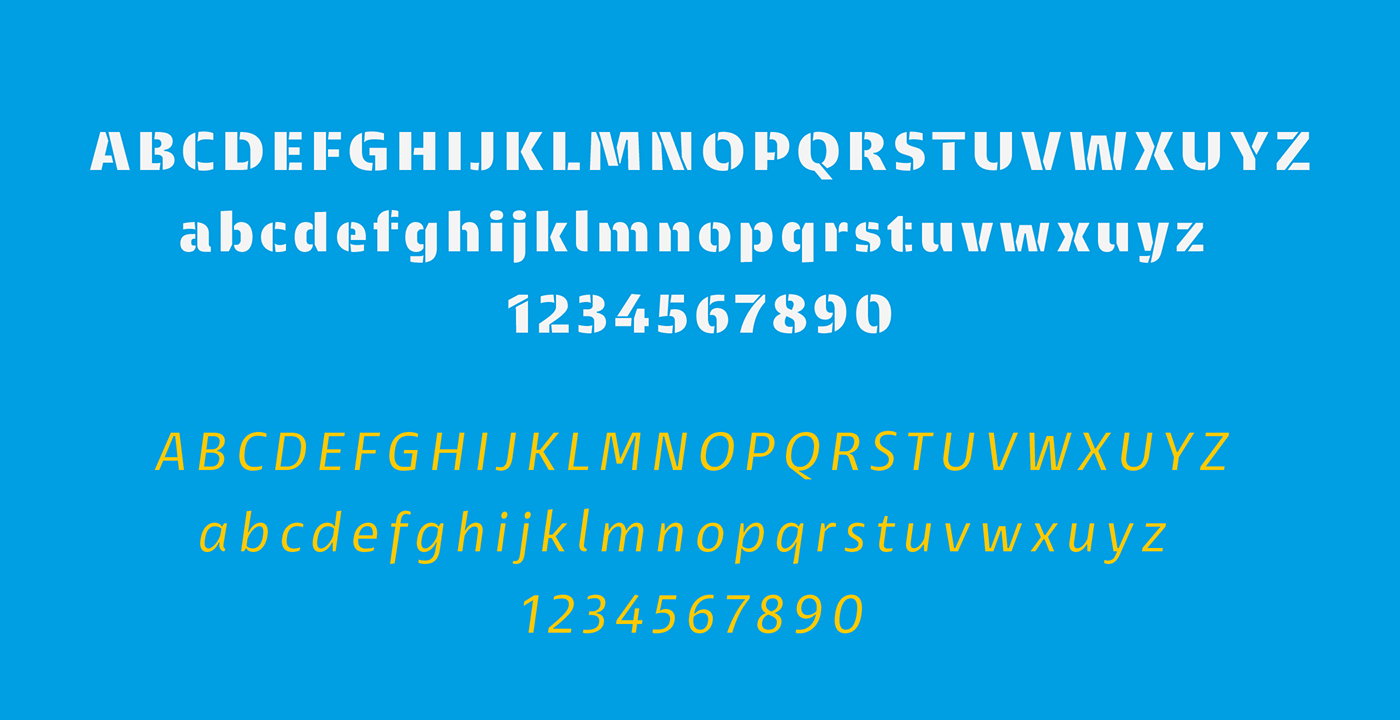
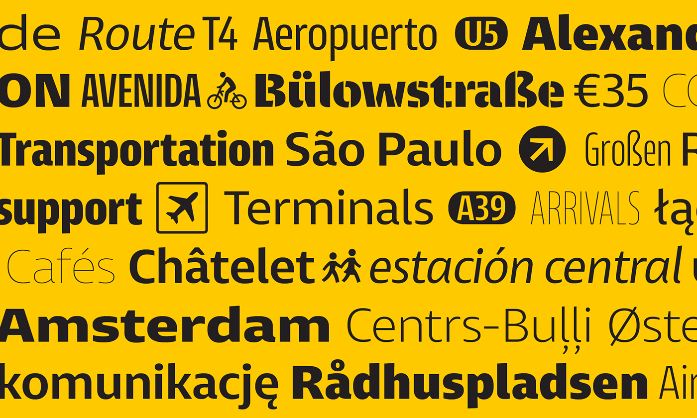
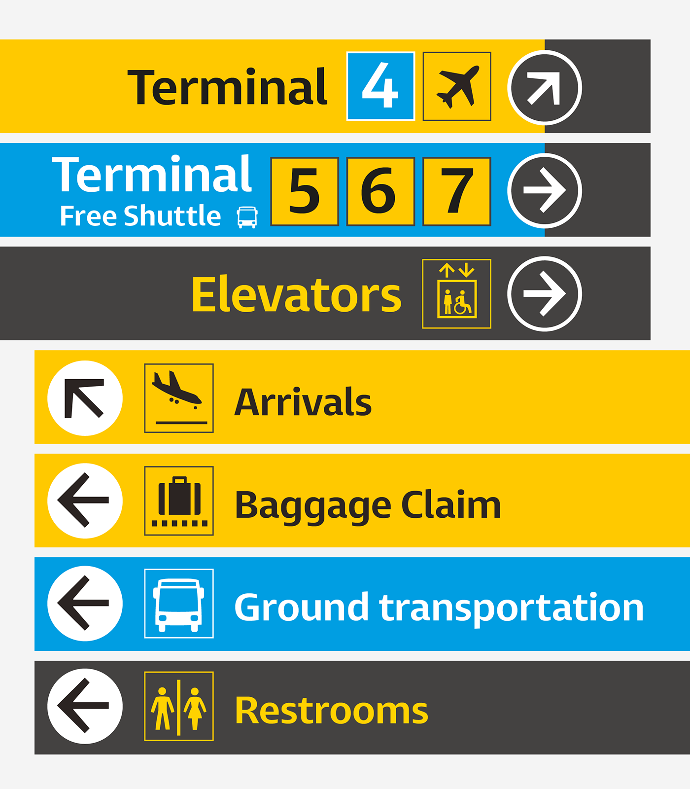
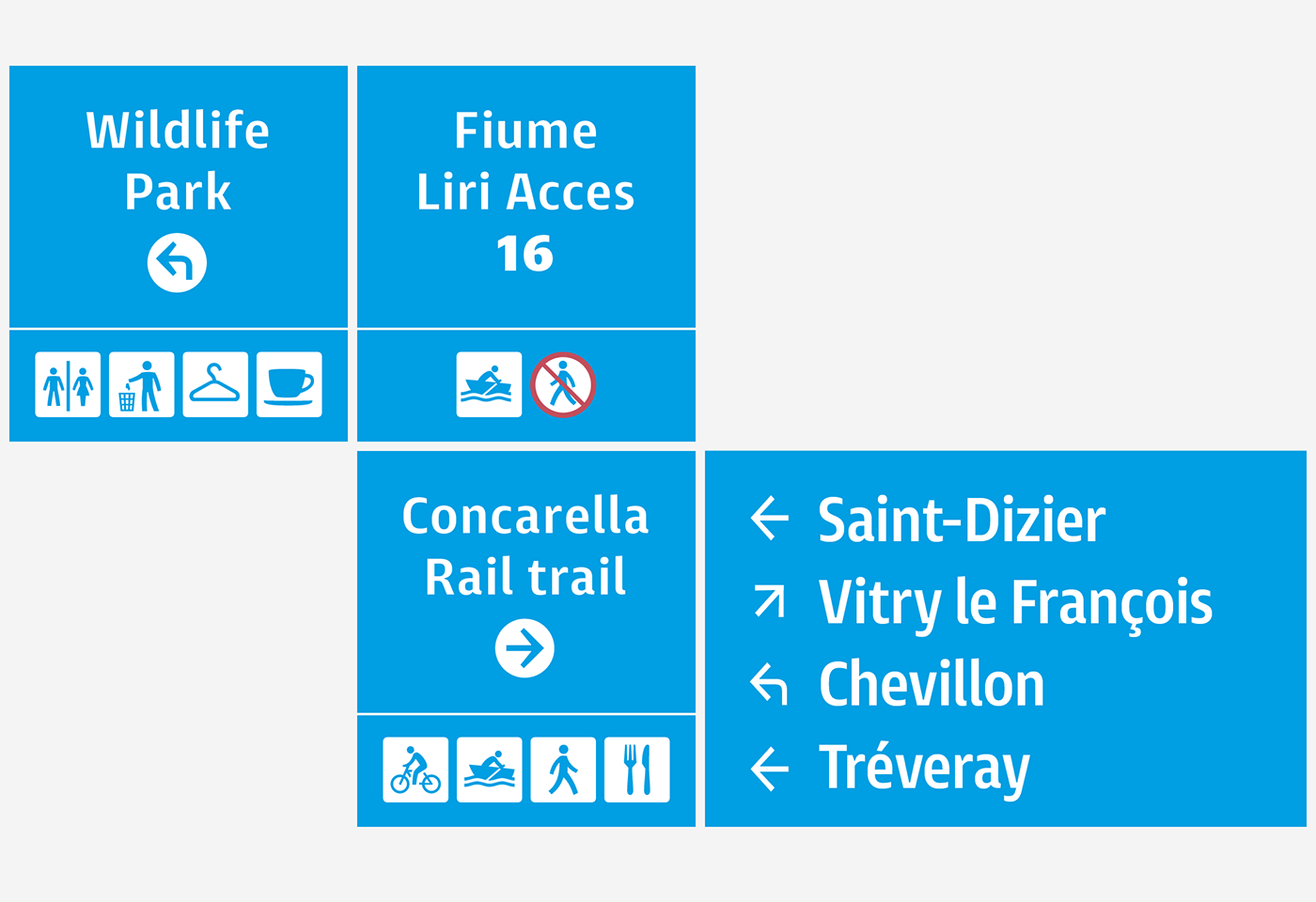
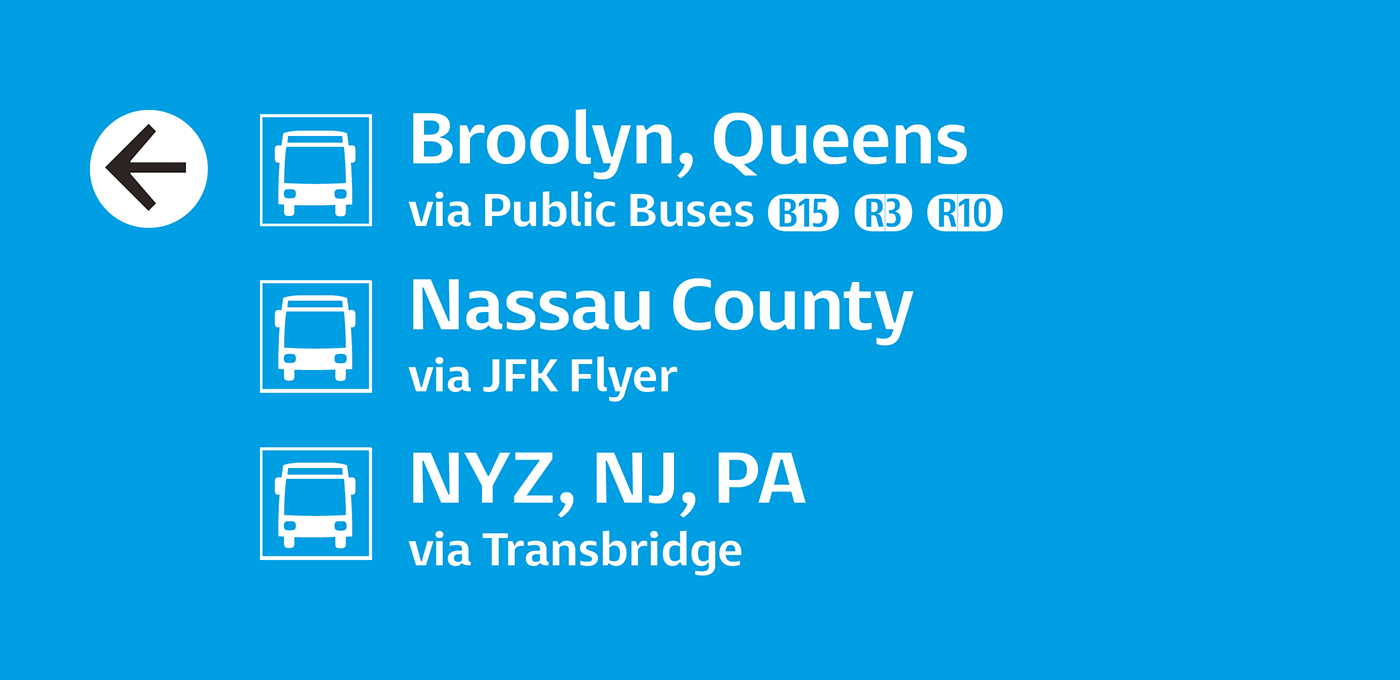
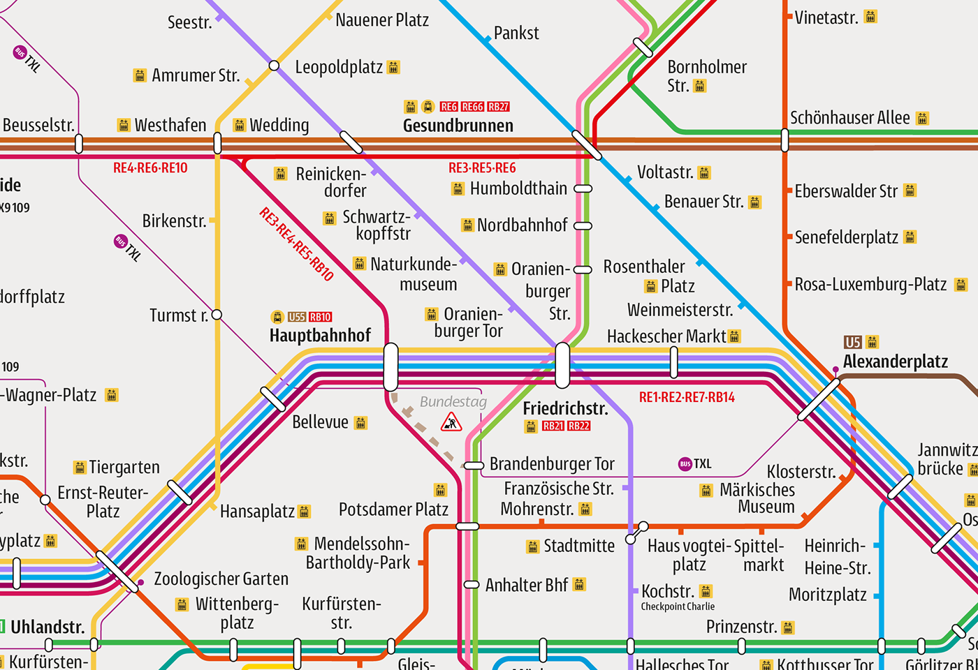
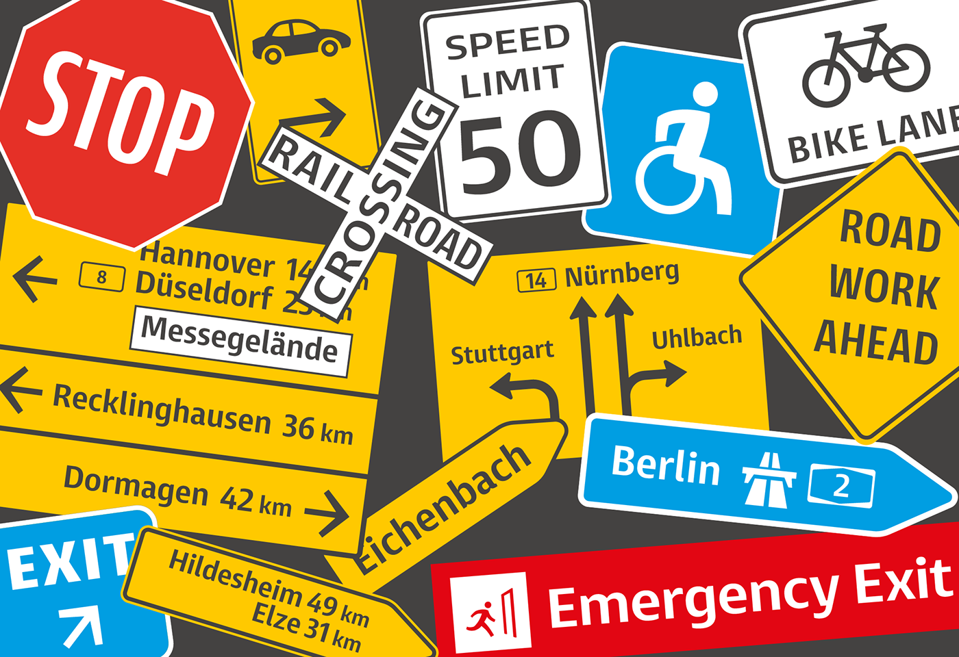
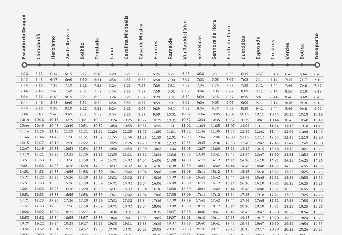
Entorno is a sans serif type family and a variable font intended for signage systems in urban and virtual spaces. It was designed to fit formal requirements for wayfinding signage, public transportation systems, maps and simulations.
It was designed pointing a generic and universal look, seeking neutrality, as well as a conceptual balance between geometry and humanism.
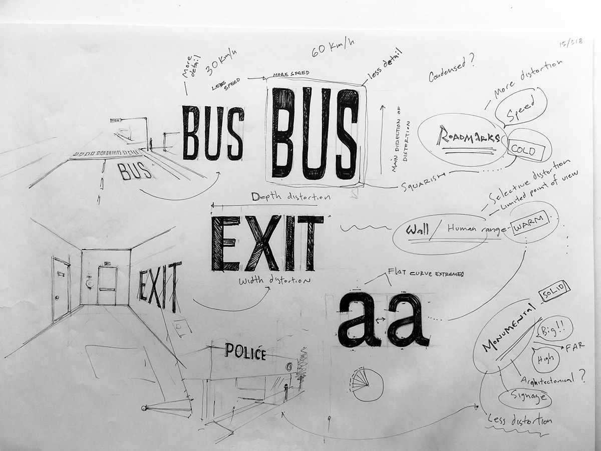
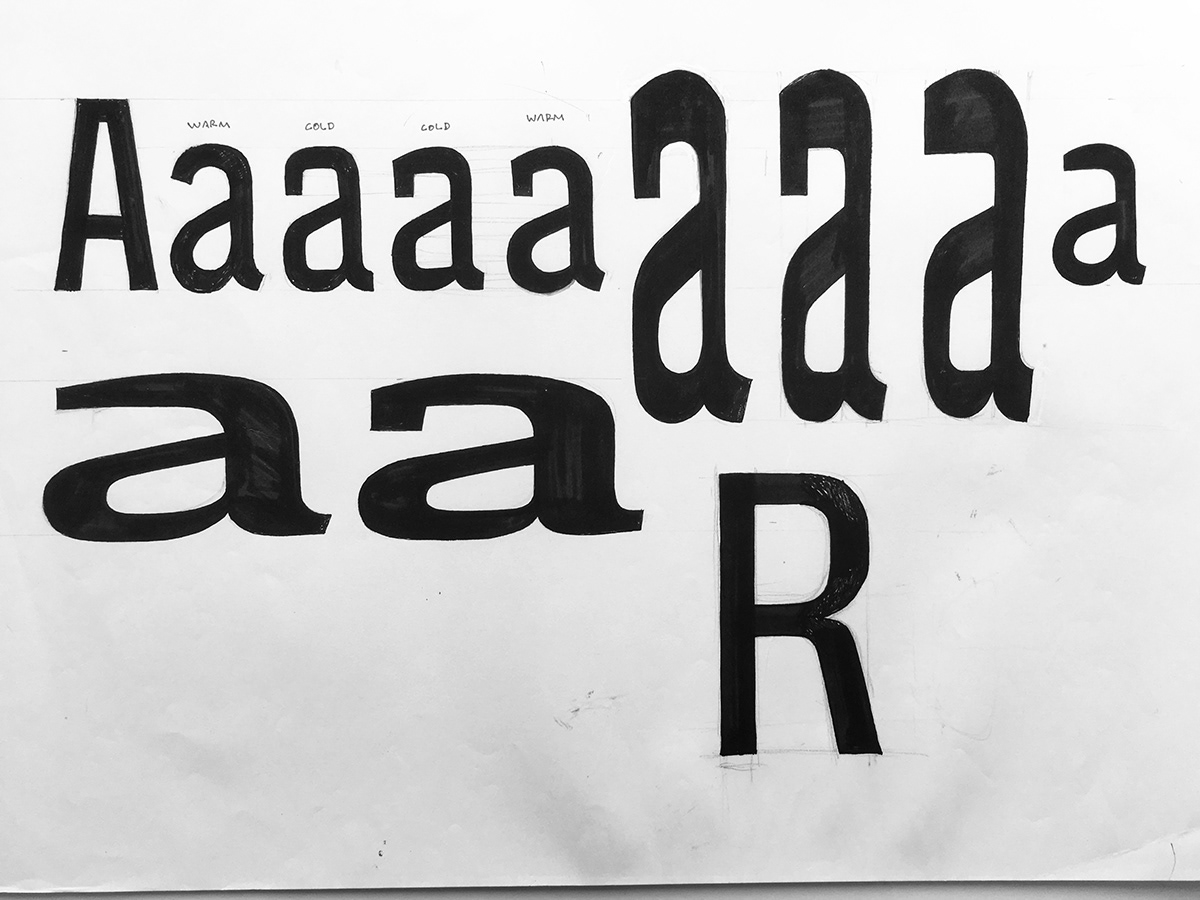
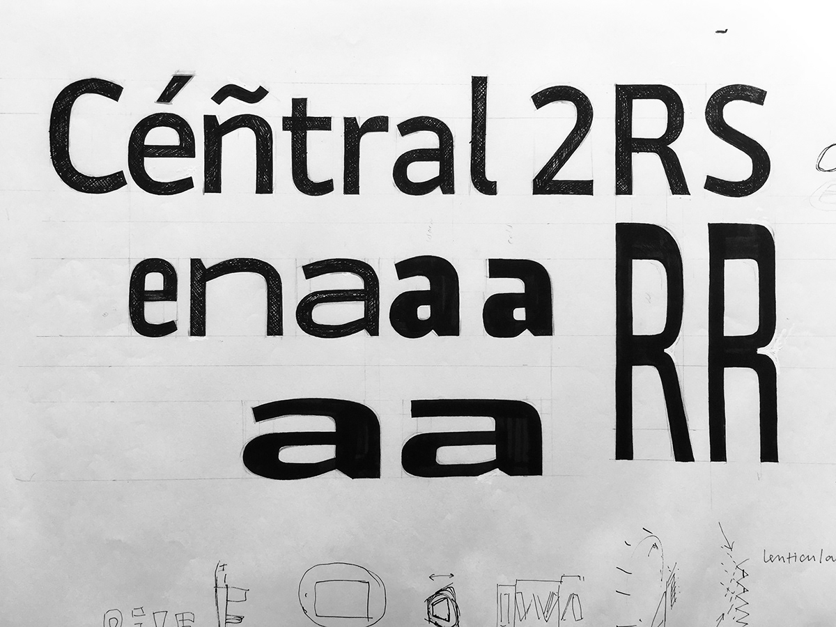
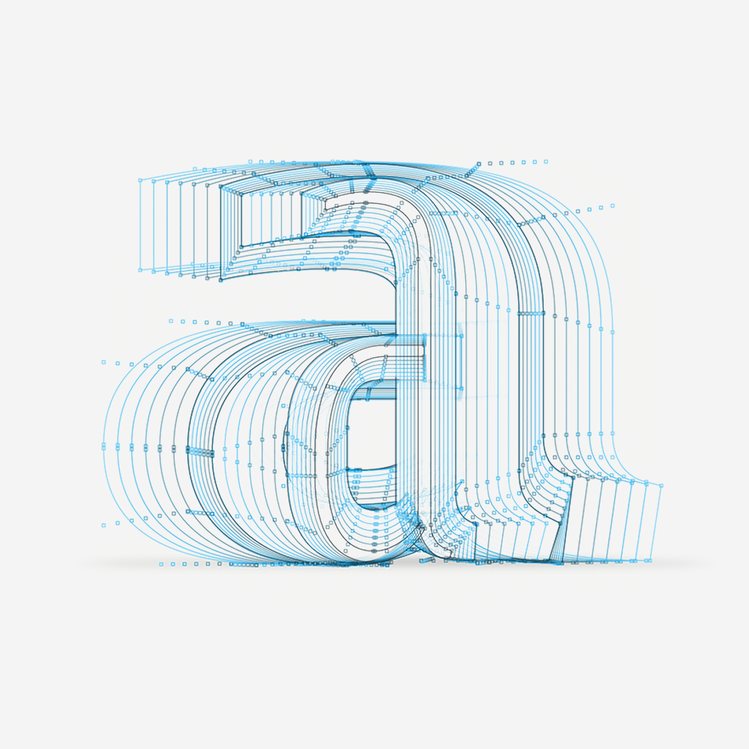
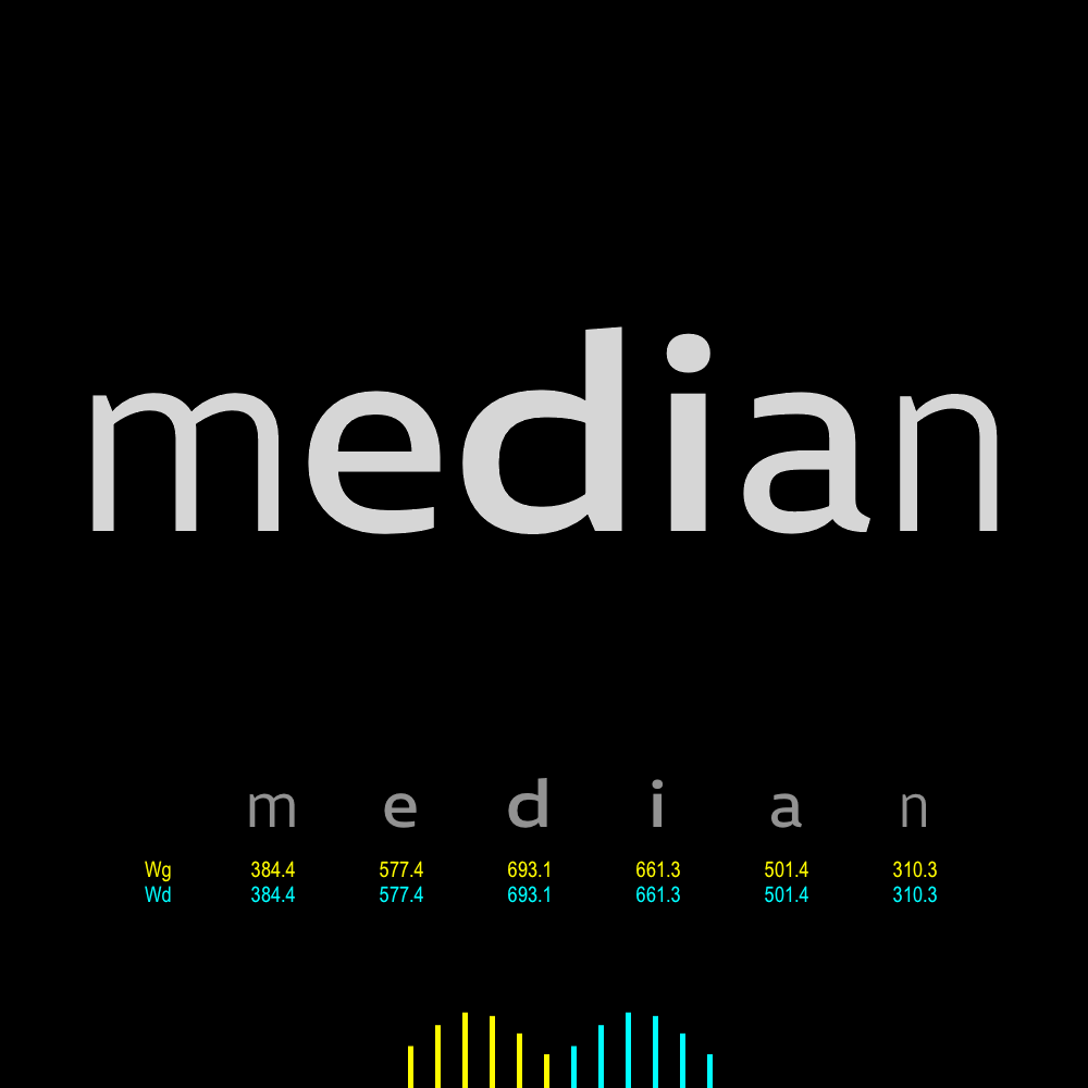
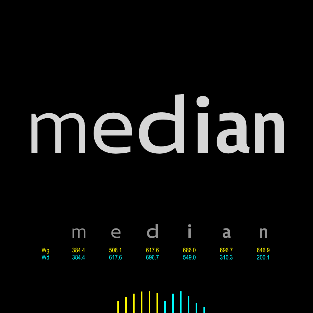
As a variable font it is constructed from a multidimensional approach, conceived to be adjusted to respond to the context of use and compensate for possible problems of legibility, by modulating its weight, width, contrast, stretching and even structure.
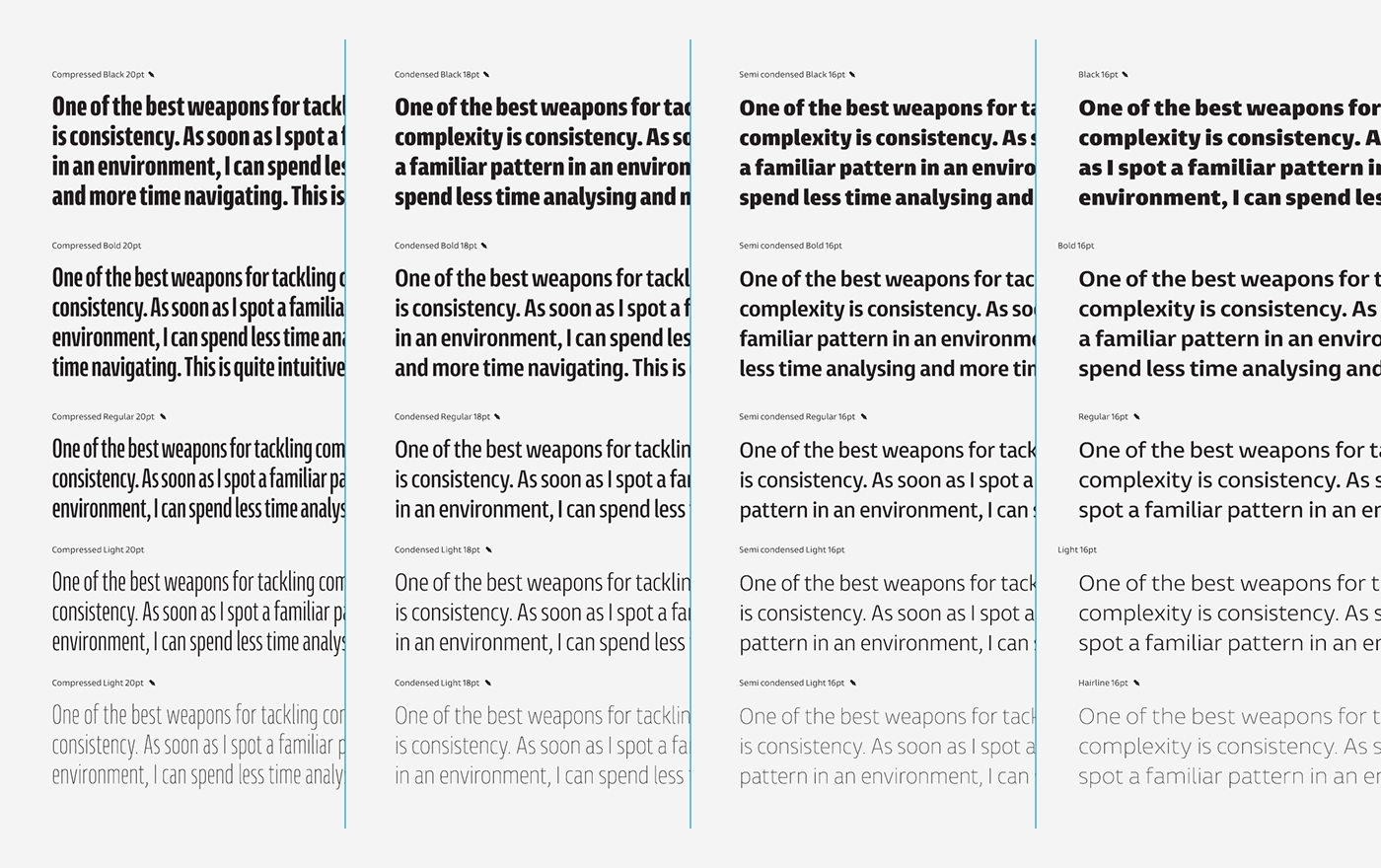
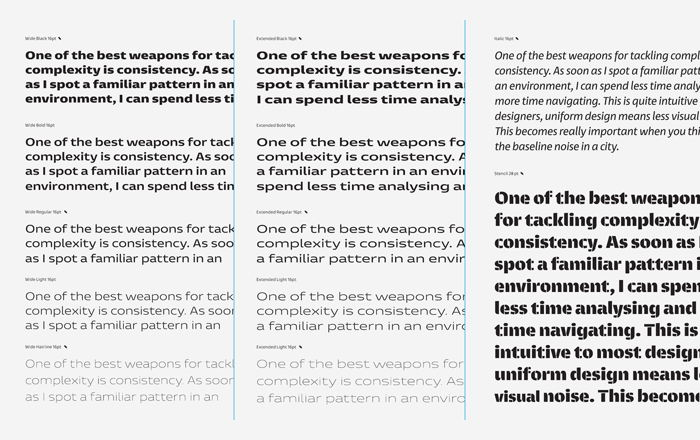
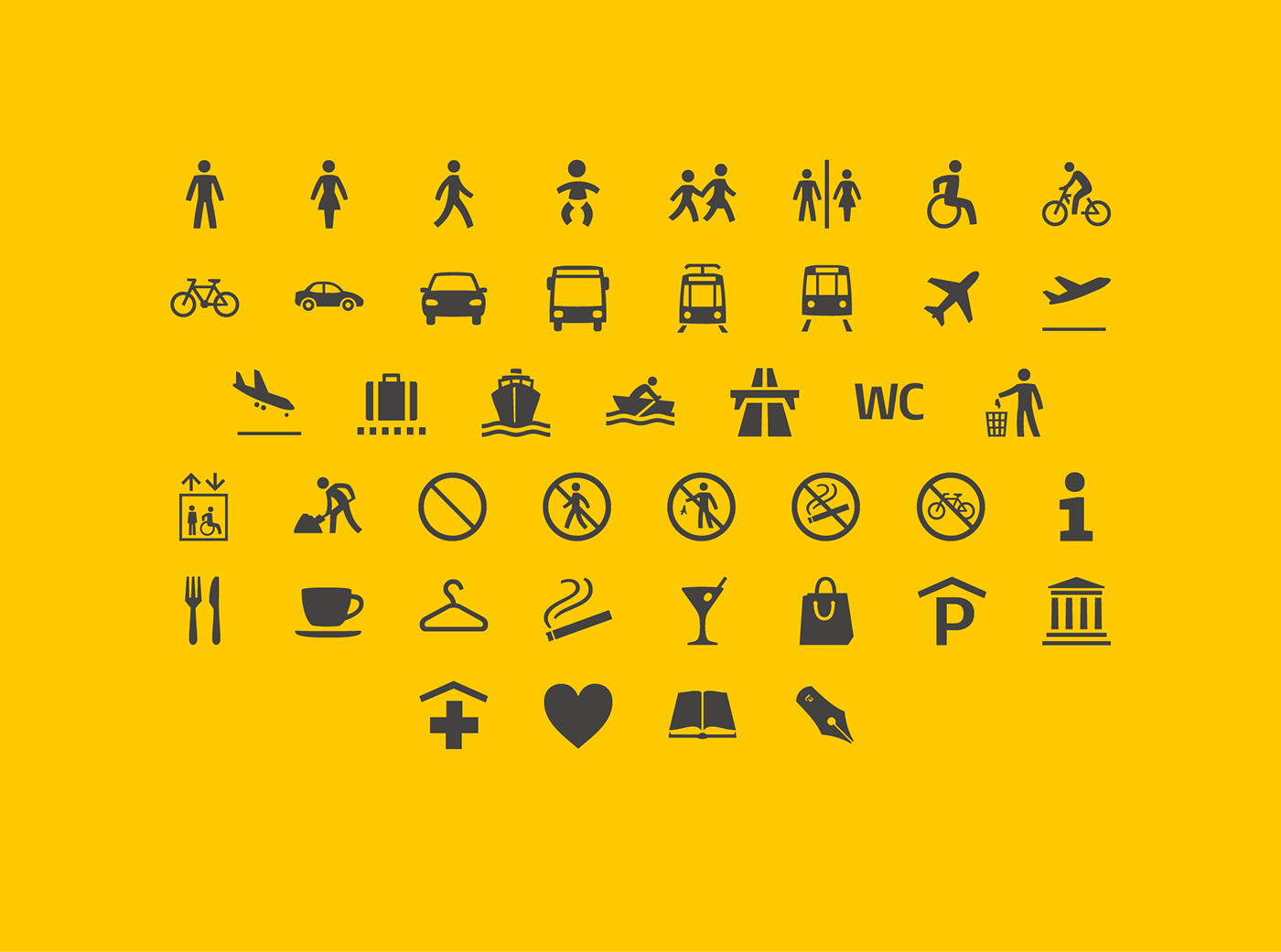
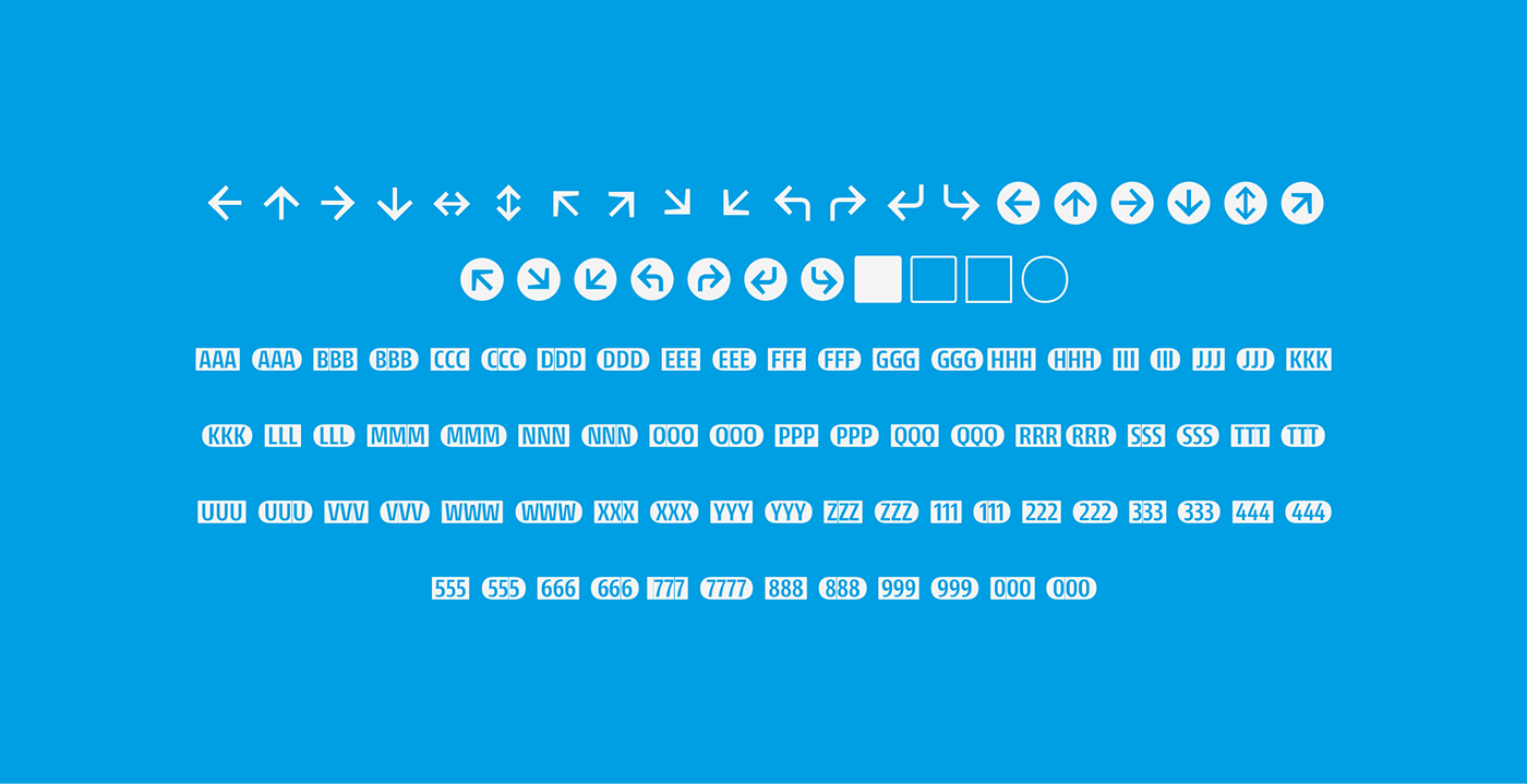
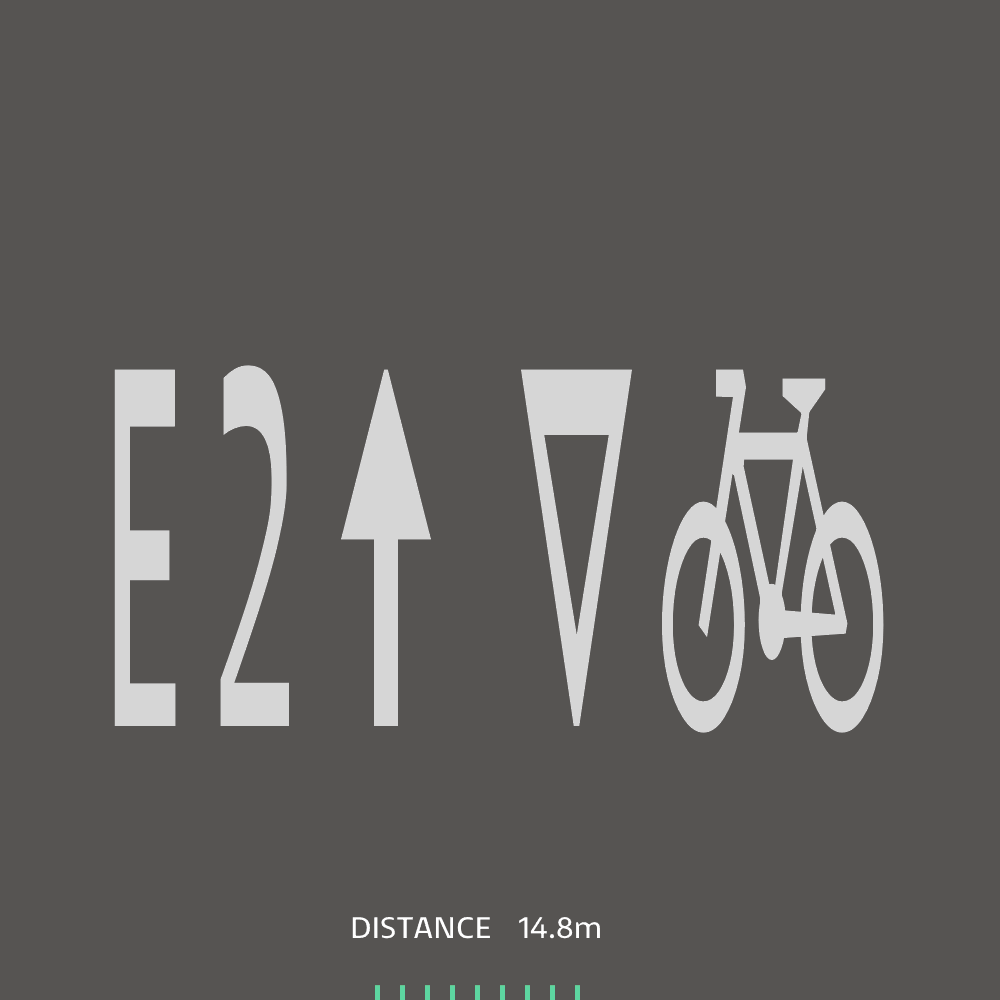
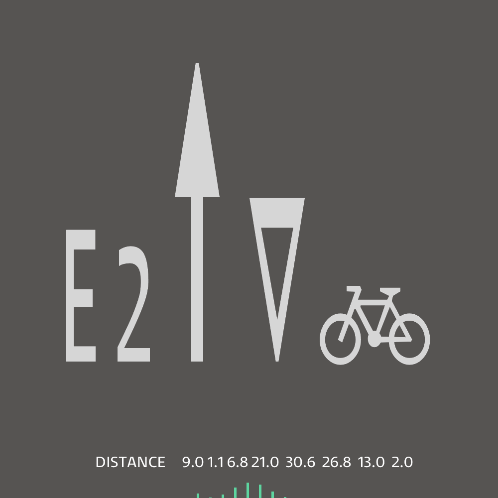
The styles scope includes 28 styles, 14 of which are masters 9 of them in the weight and width axes that constitute the extremes in the variable version. In addition, it contains 3 complementary styles: Italic, display stencil and a pictogram series .
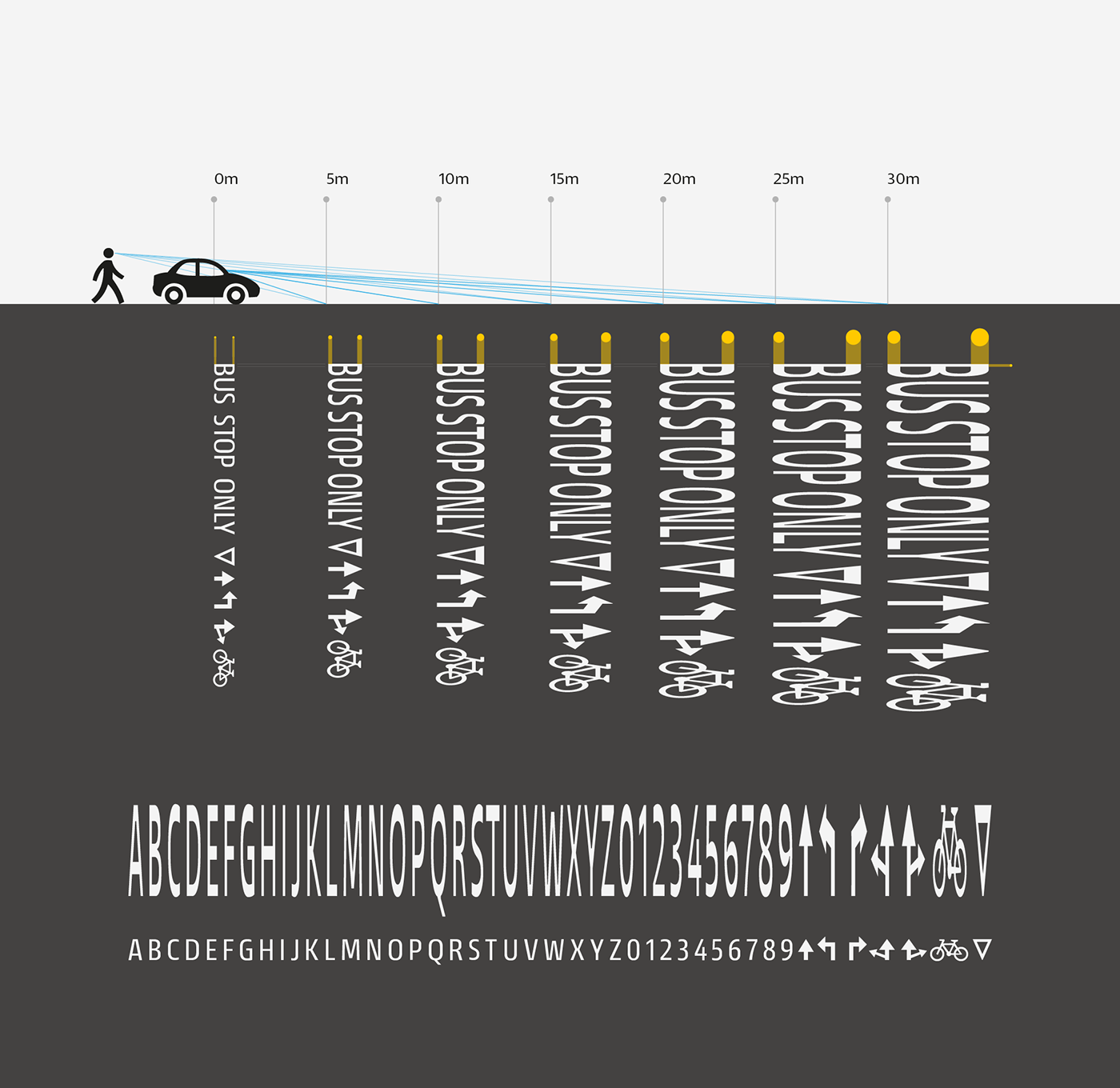
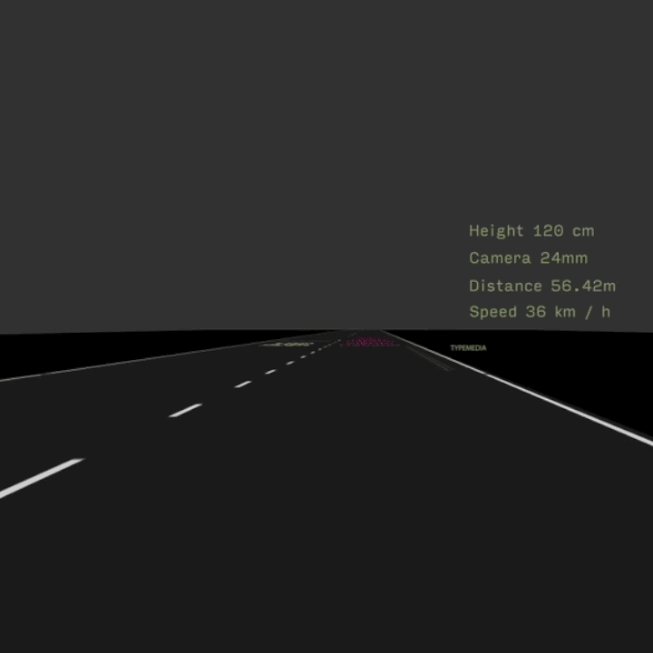
At last, the Entorno family is completed with the Roadmark 0m and Roadmark 30m styles, which are the masters in the variable version for responsive usage that considers the distance between the road marking and the viewer as an axis of the design space.
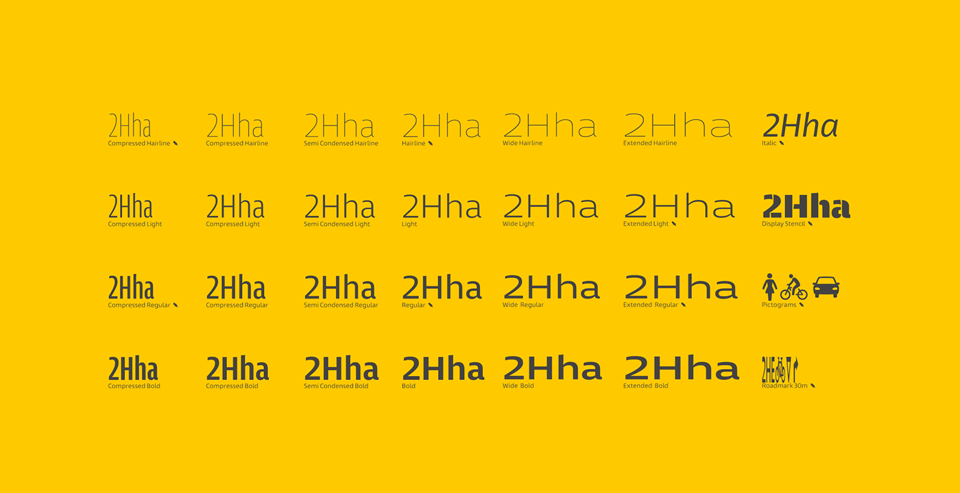
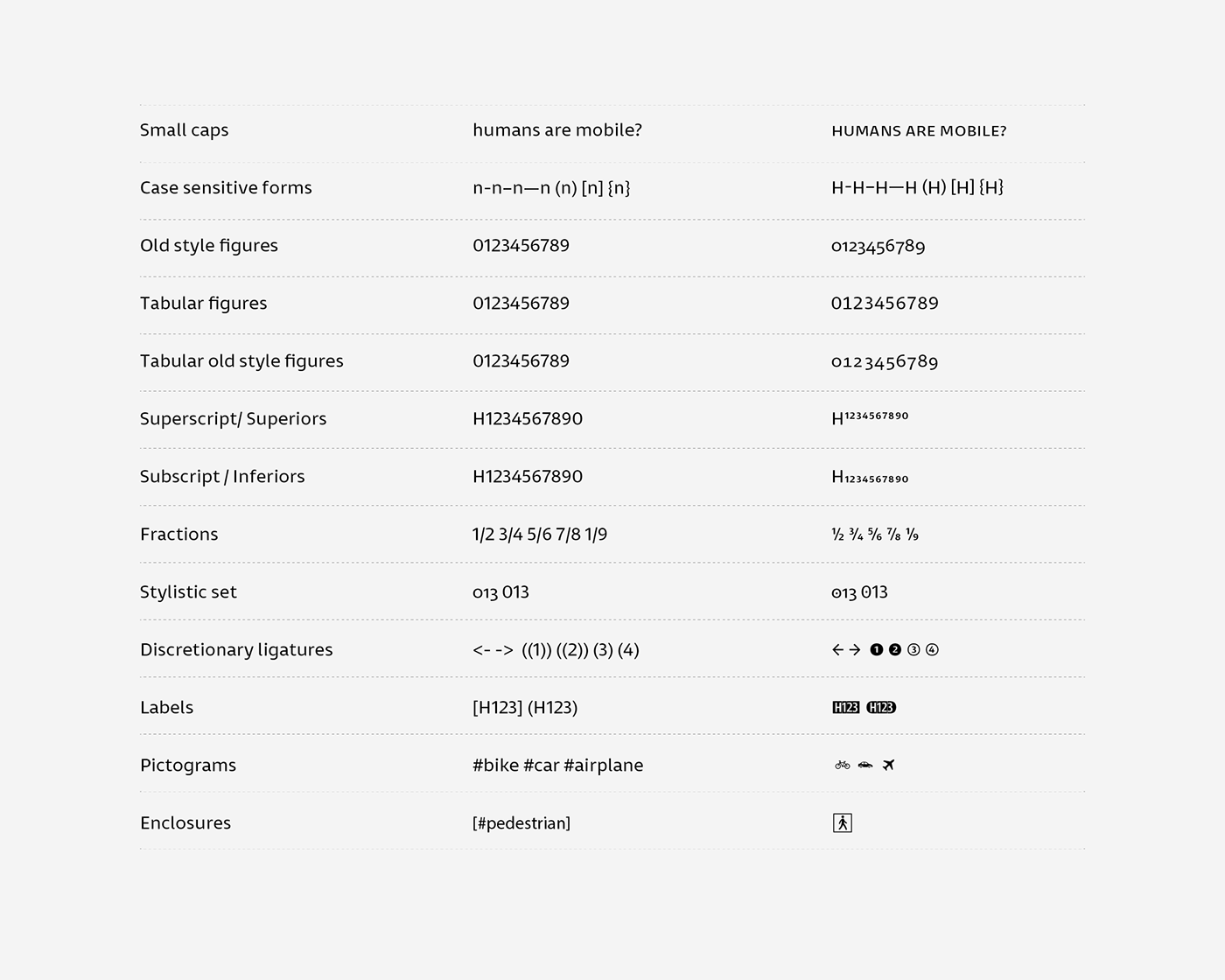
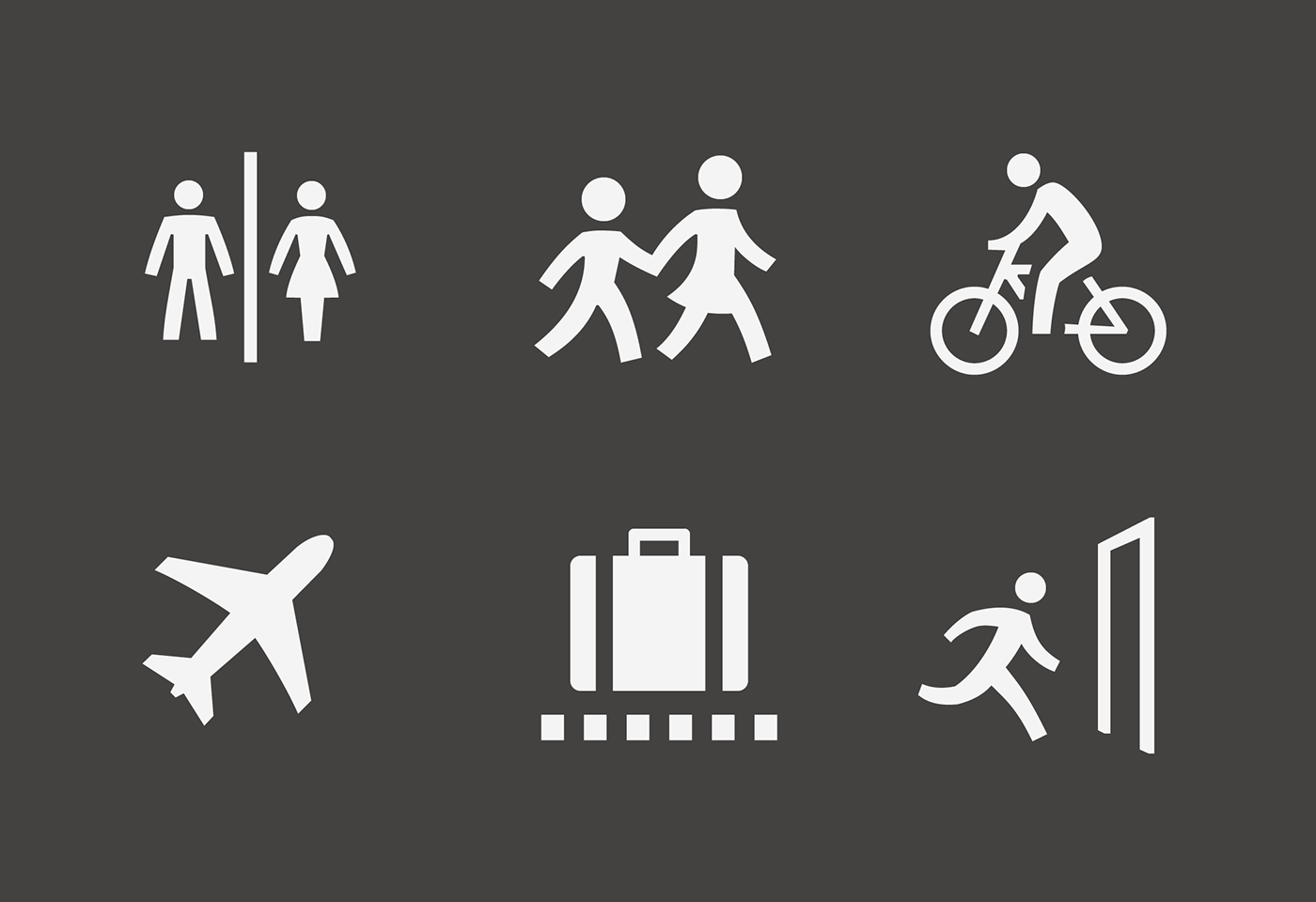
The pictogram series responds to the same design principles as the typographic family: enhancing natural features within a geometric scheme, preserving simplicity and clarity.

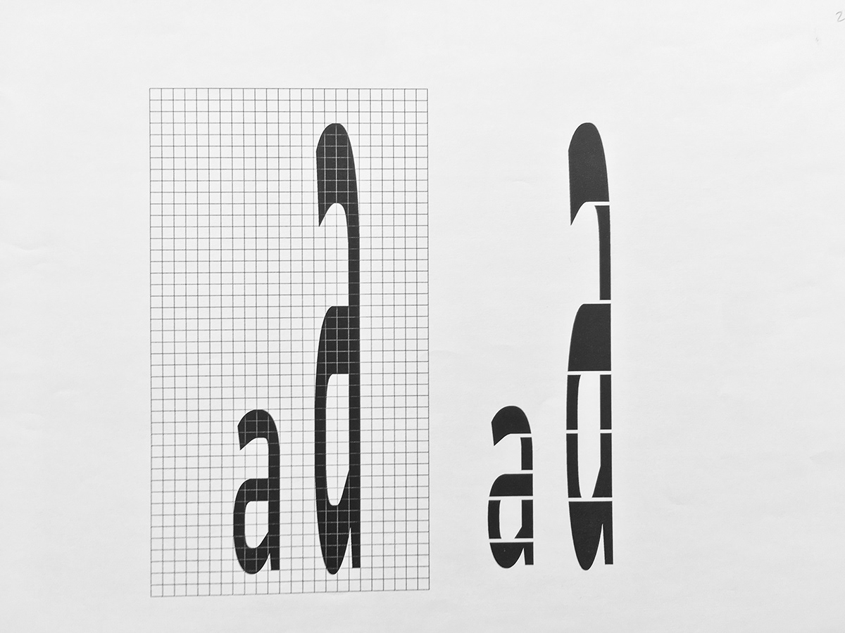
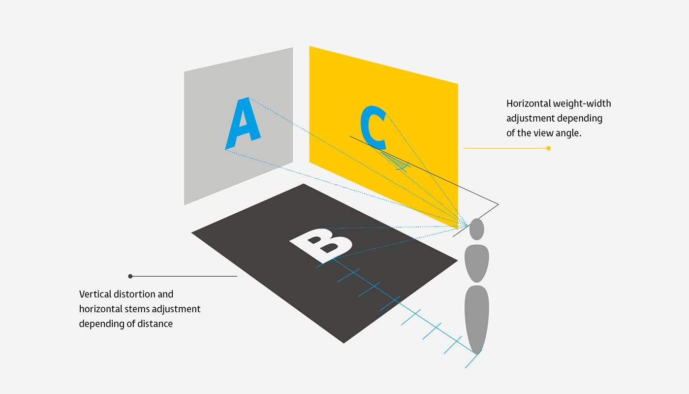
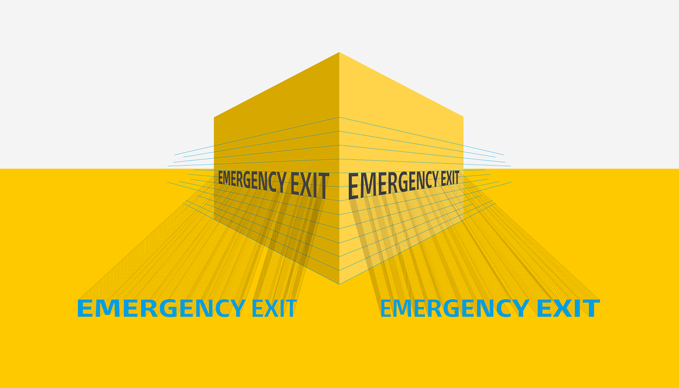
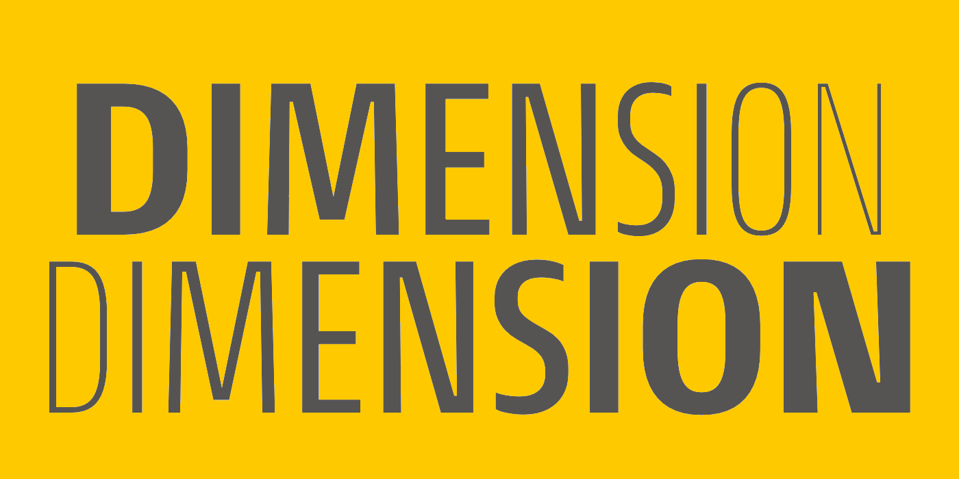
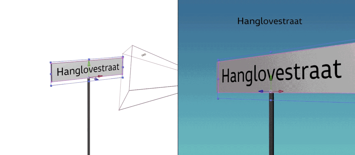
One of my main concerns was to explore the interdimensional and dynamic relationship of typography with physical and virtual spaces. Likewise, I tried to visualize and question the idea of static typography when is in interaction with the observer, propose the scenario where typography could be responsive and adaptable.
In this sense, three scenarios were conceptualized: A) Variable font that adapts in width and weight axes, B) Variable font that depending on the relative distance of the observer letterforms are stretched in its vertical dimensions without modifying the width of his vertical strokes and adjusting the weight of his horizontal strokes. C) Variable font that according on the observer's viewangle and distance, single characters adapt their weight and width to compensate or improve possible readability problems.


Entorno is a spanish word that means environment, as the conditions or circumstances that surround and influence the life of a certain entity. In this way we can consider type a common factor that manifests multidimensionally affecting our daily life.